NEGATIVES
Typography
Munich University Of Applied Sciences
Project led by : Prof. Xuyen Dam
2016
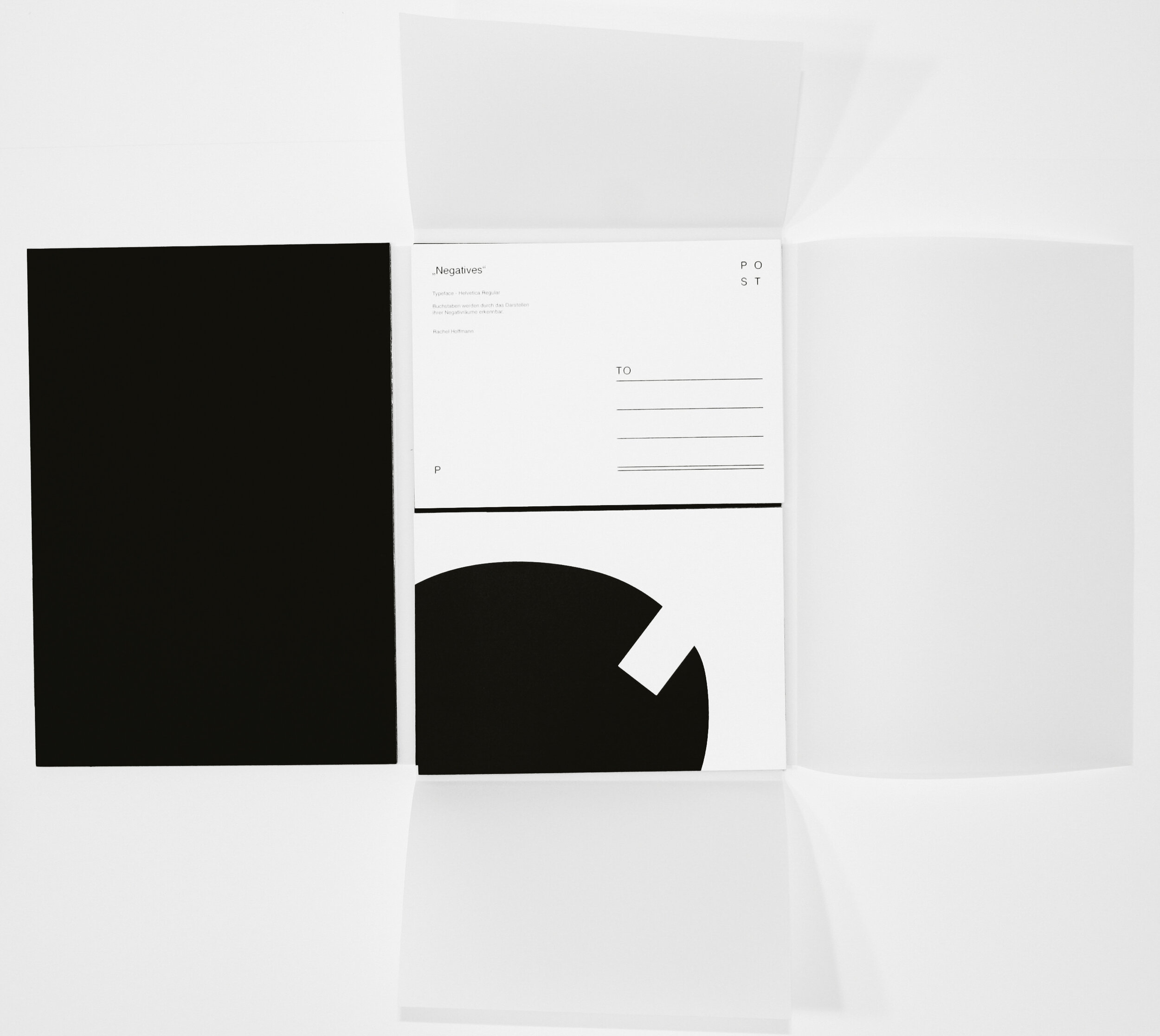
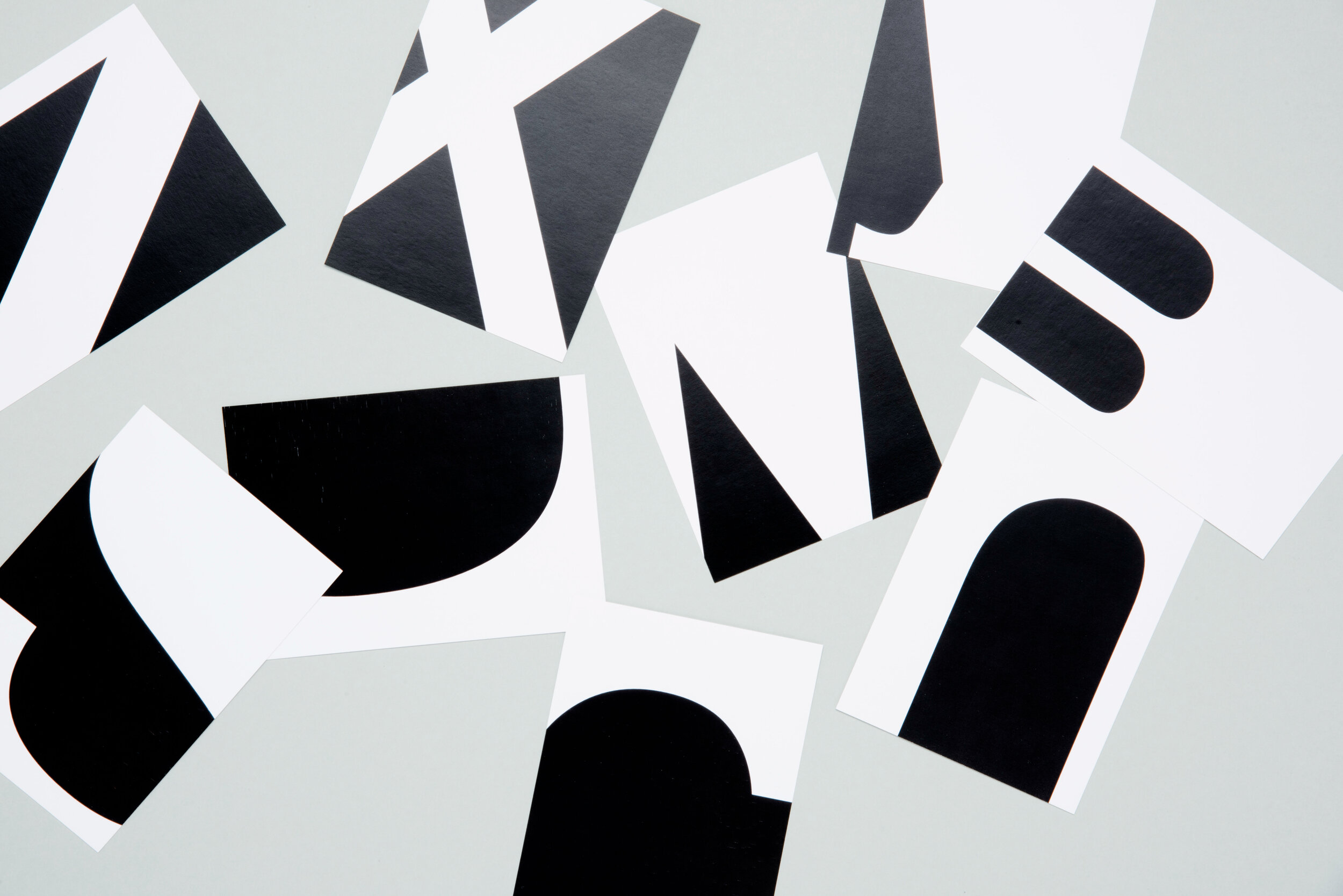
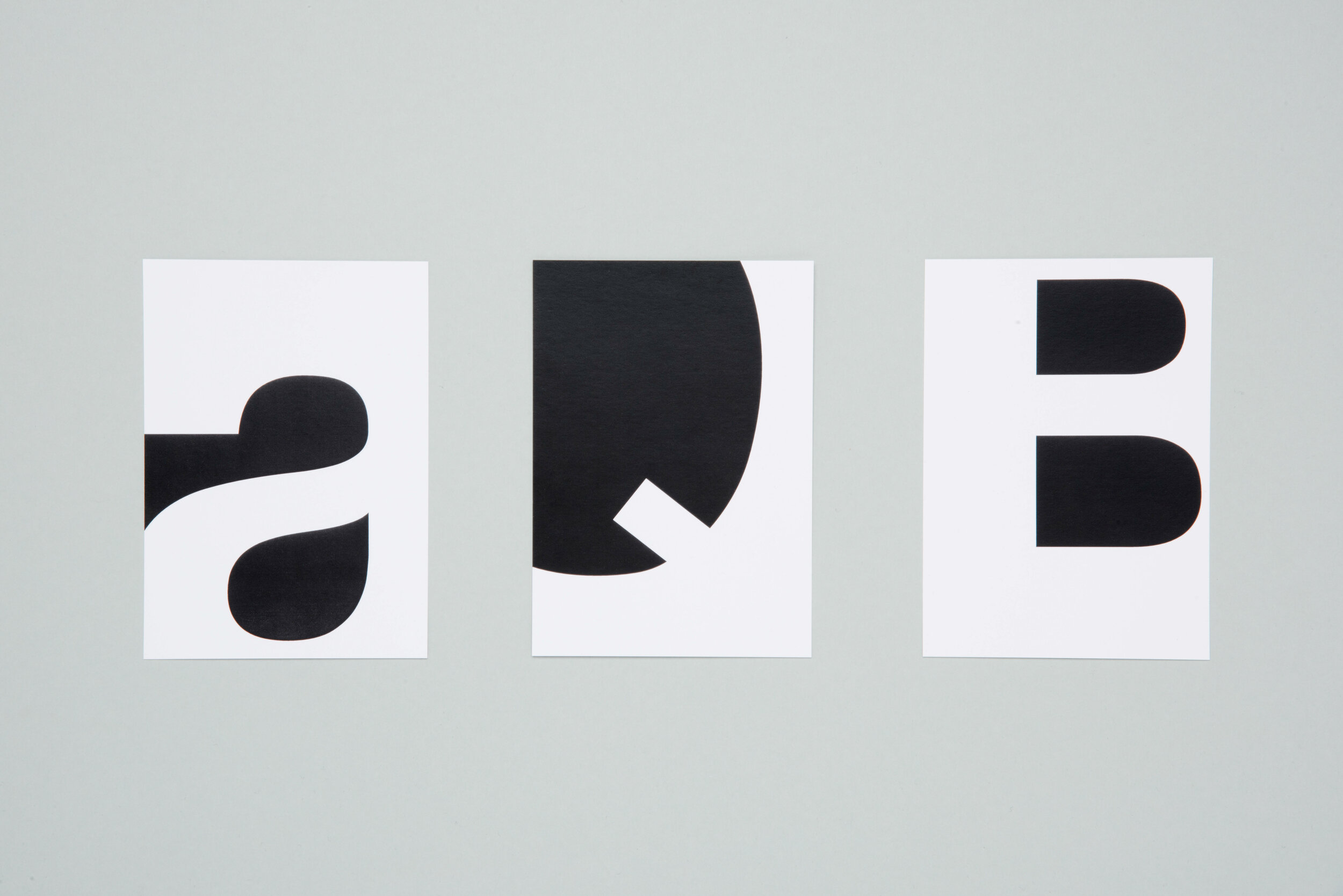
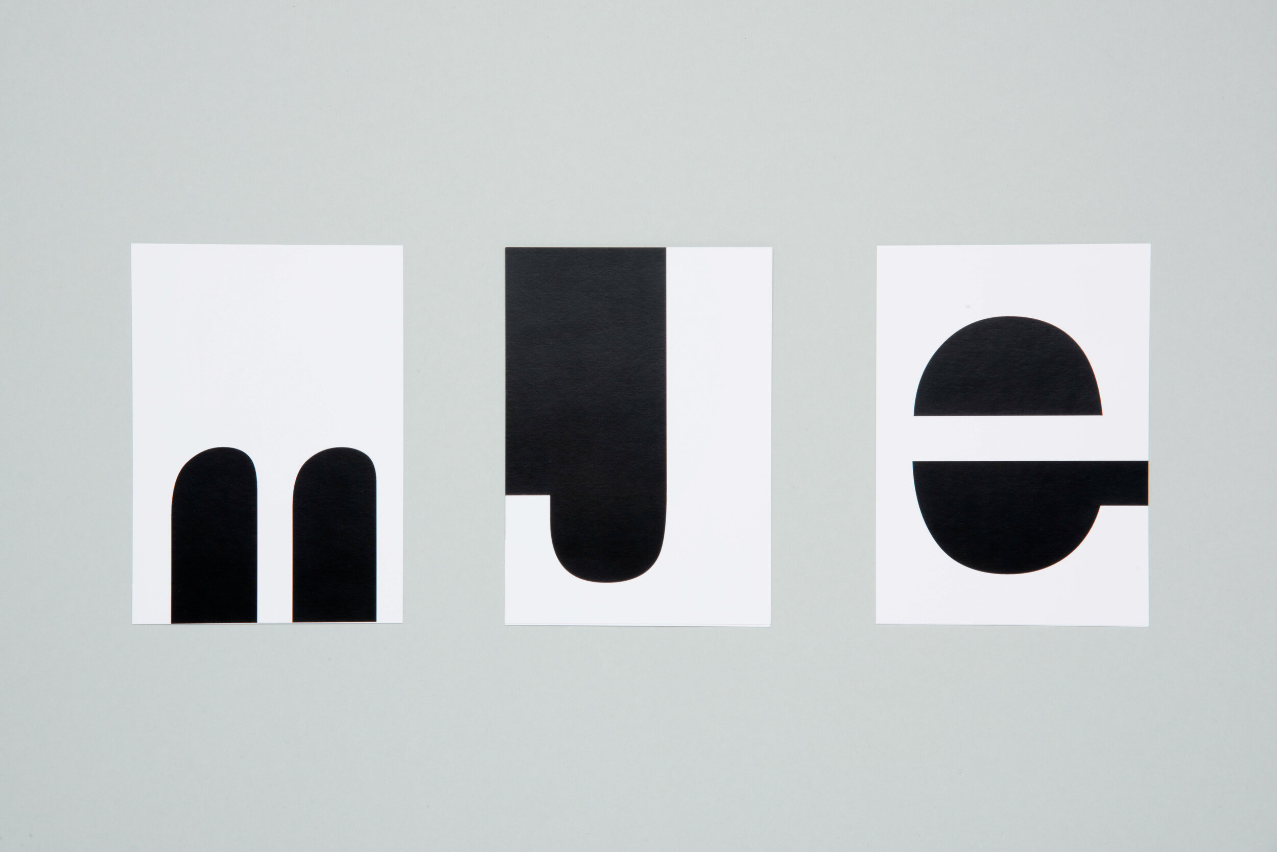
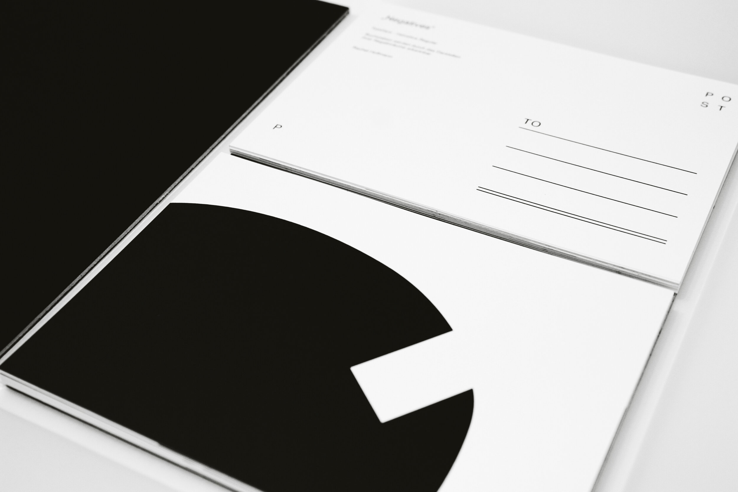
Negatives is a typographic postcard set which plays with the forms and negatives of the letters. Every postcard holds one letter which is determined by its minimalist surfaces and monochromes. The typeface „Helvetica regular“ has been chosen due to its popularity and perceptibility in order to facilitate the intuitive legibility of the different letters.
The set includes twenty-seven cards so that every letter of the alphabet is being represented. Whether the letter has been depicted as a capital or small letter has been decided based upon the letters’ distinctiveness compared to other letters and upon its capability to play with the negative forms.
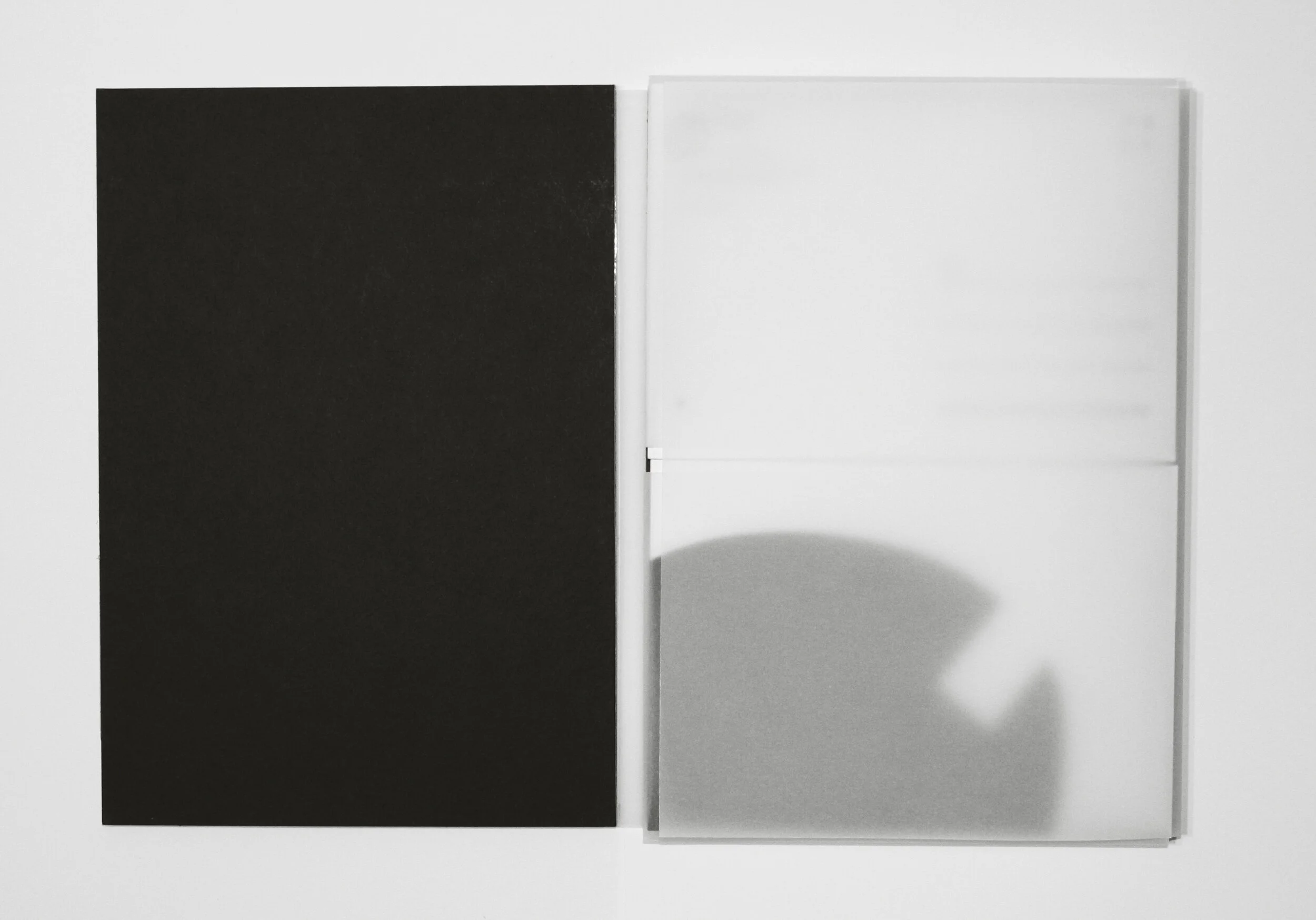
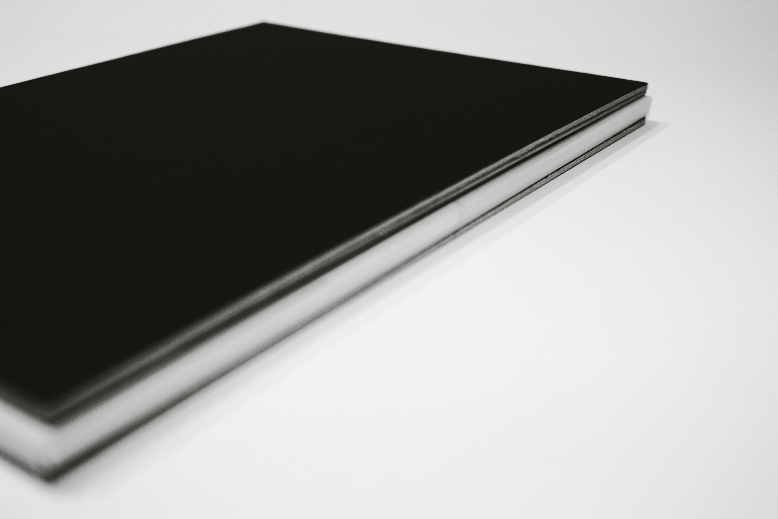
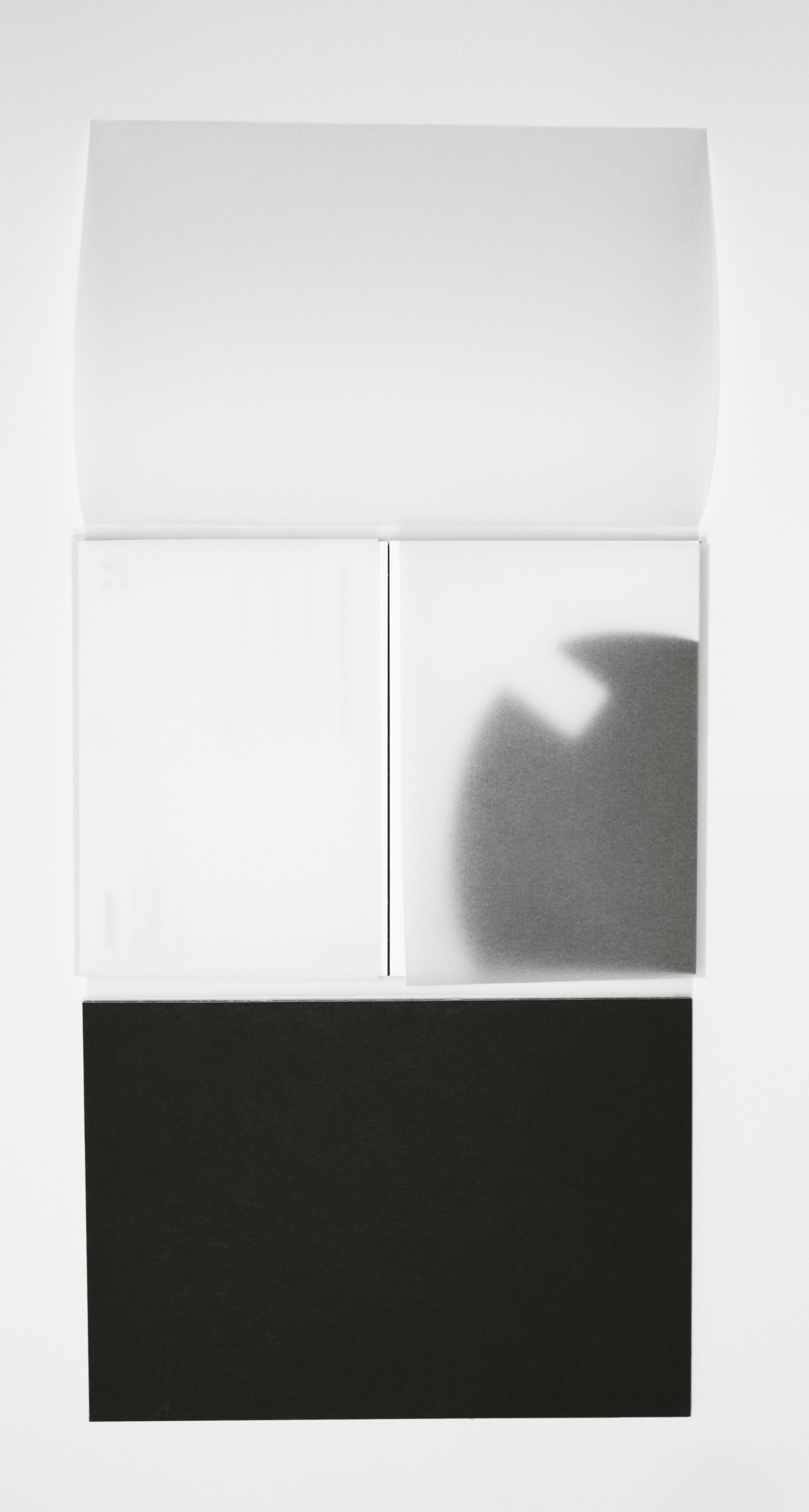
The packaging has a look that is similar to a book which, due to its material, refers to the negatives of the letters. The translucent paper adds an aspect of facility and refers to the white forms of the letters.
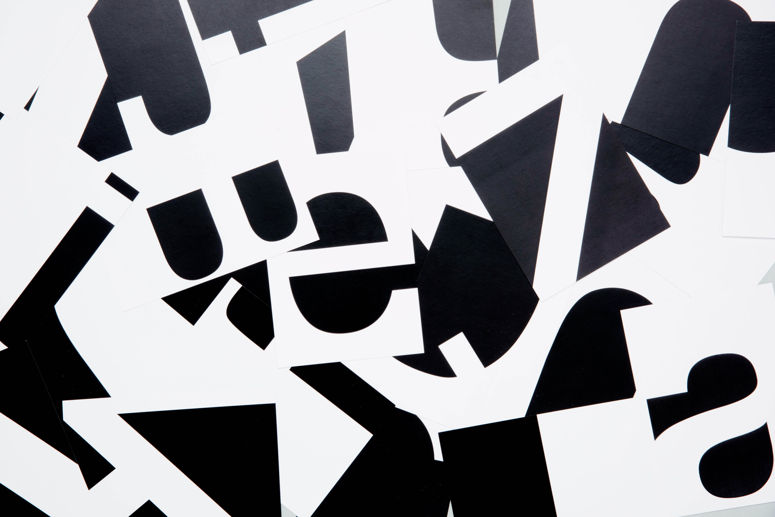
Negatives focuses on graphic communication and traditions by reviving a medium which becomes more and more uncommon to people: the postcard. The viewer can not only enjoy deciphering the different letters of the typographic set, but also starts experiencing letters and their forms in a very different but beautiful way.